Category: Uncategorized
-
Cine De Oro: The Golden Era of Mexican Cinema

This week we took a look at the golden age of Mexican filmmaking known as, Cine de Oro. This era in Mexican cinema represents a shift into the global landscape of filmmaking. In the 1930s to the early 1960s; Mexican cinema took center stage fueled by artistic innovation, cultural significance, and international recognition. This dashboard…
-
Visualizing Nascar Data
Dashboard of Nascar data for the 2023 season Today we look at Nascar data from the 2023 season. The season consisted of thirty-six races with at least twenty stock cars each race. I recently watched the recent season of Full Speed on Netflix; which was an in-depth view into the 2023 race season. This season…
-
Grip it N’ Rip It!!

A Tableau view of driving statistics during the 2023 PGA season. Data Used: PGA Website has data for all pertinent statistics for each player/event. For this post, I used driving statistics for all players in the PGA data portal for the 2023 tournament season. Credit: I wanted to visualize driving statistics by showing the average drive…
-
Dashboard of Top Hollywood Directors

Dataset: Tableau | IMDB Data Today we look at the top directors in Hollywood by various parameter values. By incorporating measures like Film Count, Best Picture Nomination Count and IMDB Rating. We are able to assess the Top 50 directors by those parameter values. This was another opportunity for me to use fixed images as the background for…
-
Data Exploration of the Filmography of Martin Scorsese

Today, we participate in the ‘Data+Movies’ Tableau series in conjunction with an assessed IMDB movie dataset. Note: the dataset is shared via Tableau Public. I decided to view the filmography of the great Martin Scorsese. He has directed some of my favorite movies and has been nominated for Best Picture/Best Director multiple times throughout his career. Personal…
-
Creating a ‘Long-Form’ Dashboard

Using 2023 Tour de France Data So I am not sure if ‘long-form’ is the official term for these types of dashboards but for the sake of this conversation let’s pretend it is. I saw these types of dashboards for the first time years ago at a Tableau Conference when many Tableau Public dashboards were…
-
Alteryx: Data manipulation with spatial data
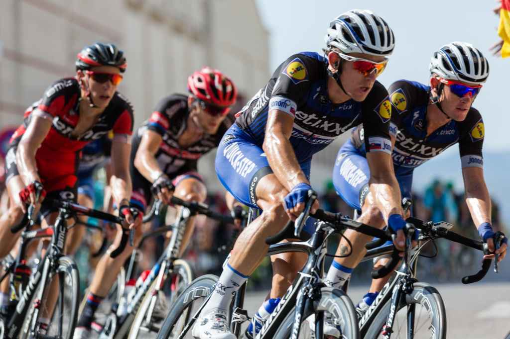
I received some Tour de France data from an online cycling website today. The data was in GPX format and it was a list of coordinates by stage. During the 2023 event, there was twenty-one stages starting in Spain and ending in France. Each GPX file is a sequential list of coordinates (latitude, longitude); each…
-
Create Pareto Chart and Box Plot Chart in Tableau

This week I took a stab at creating both a Pareto chart and Box Plot chart. A Pareto chart is a dual chart with bars and a line graph; individual values are represented by bars and the building cumulative total is represented by a line graph. Named after Italian engineer Vilfredo Pareto who made the…
-
Strengthen Your Dashboards with Parameters

What are parameters? Parameters are a workbook variable that is defined as a number, date or string. It can act as a filter, reference or replace a value in your data source. With parameters you can also create ‘parameter actions’ that let’s the user dynamically change set parameters when interacting with the viz. I like…
-
Creating a Waterfall Chart in Tableau

A waterfall chart is a type of bar chart that can explain net change of a measure from across all its contributing cohorts. This is a bar chart that is mostly used in the financial services industry. Analyzing change over time can show attribution of change to specific groups to the overall change of said…
