
Visualizing the incredible career of Juan Gabriel through data
This is part one of a three-part series that walks you through my recently built dashboard. Title of the dashboard is called: Juan Gabriel-Emotion, Sound, and Legacy. This visualization takes a deep tour in the career of Mexican idol Juan Gabriel analyzing his career and song portfolio. Throughout this project, I not only learned about the genius of ‘JuanGa’; I was able to peel the layers of the surface to fully understand how his music resonates with listeners for more than five decades.
Below is the breakdown of the three-part series:
- Dashboard design:
- Visualizing your template and crafting your story
- Scatterplots:
- Focusing on song mood and assessing song quality
- Viz Extensions & Embedded Web Objects:
- Linking vizzes together to build an overall picture
Who is Juan Gabriel: El Divo de Juarez
If you’re not familiar with Juan Gabriel, take a seat—because you’re about to discover an artist who may soon find a permanent place in your “Liked Songs” playlist.
Born Alberto Aguilera Valadez in Michoacán, Mexico, Juan Gabriel was a singer, songwriter, and entertainer whose life story is as powerful as his music. The youngest of ten children, Juan grew up facing significant hardship. Those challenges eventually led his family to relocate to Ciudad Juárez, Chihuahua, a move that would quietly shape his future.
Shortly after arriving in Juárez, Juan was enrolled in a boarding school designed for children with limited means. While many viewed it as an orphanage, for Juan it became something entirely different—a place where he felt normal, supported, and hopeful. It was there that the foundation for his resilience, creativity, and belief in a future truly began. Through his hardships growing up; his hope for a career in music never faltered. As a teen, Juan was already writing songs but what later made him unique was his ability to find the vulnerability of emotion and intertwine it with his songs. Beyond being an extraordinary songwriter, Juan Gabriel possessed a rare ability to sing with such emotional depth that his performances connected with listeners.
Lastly, I had the ability to watch the recent documentary on Netflix titled: Juan Gabriel–I Must, I Can, I Will. The doc really dissects not only the genius of Juan Gabriel as an entertainer but who Alberto the person really is. You can truly see the connection and impact he had on his fans and the Latino music industry.
As a Mexican-American myself whose family originated from Juarez. We as a family always had Juan Gabriel playing in the house. His music has a deep connection with me and always brings back amazing memories growing up. I remember helping my sister clean the house listening to his albums from the 70s and 80s. I remember the family watching prime time TV interview/concerts Juan Gabriel would do on spanish television. I just knew that exploring his unique genius was definitely a topic I wanted to viz about.
Let’s chat about dashboard design
For developers that build visualizations, you know that this is a process that does not necessarily start when you have your BI application open. It starts with an idea and it grows to the drive to build something. Like most things that are built; it starts with a plan. A blueprint for construction, a battle plan for war, a script for a play or a setlist for a concert.
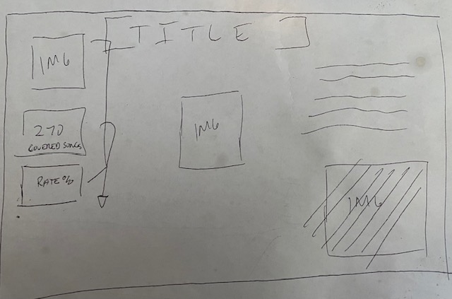
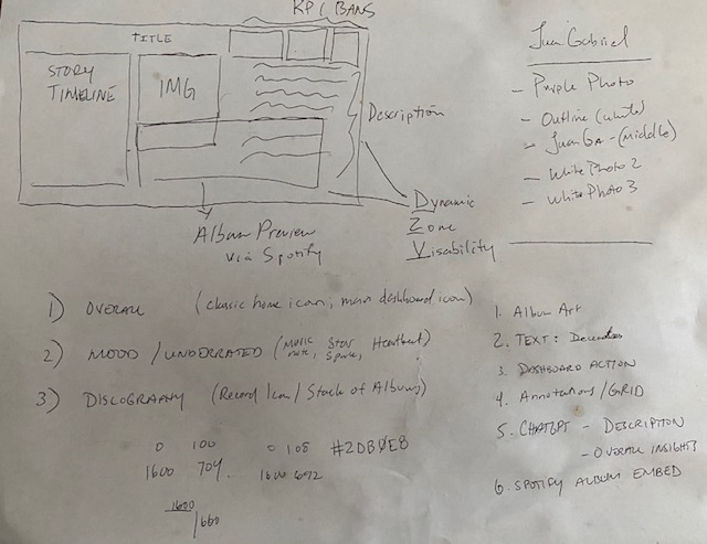
For me it starts with a drawing. I like to create some drawn wireframes on paper; it helps me visualize how I can arrange components of the story I would like to tell. Remember, that story may evolve as you are building the visualization and that’s okay. However, a formulated blueprint can more times than not lead to a great design. For those that have not created a blueprint its fairly easy and does not need much substance. I have attached some pictures below on some blueprint work I have done on my visualization.
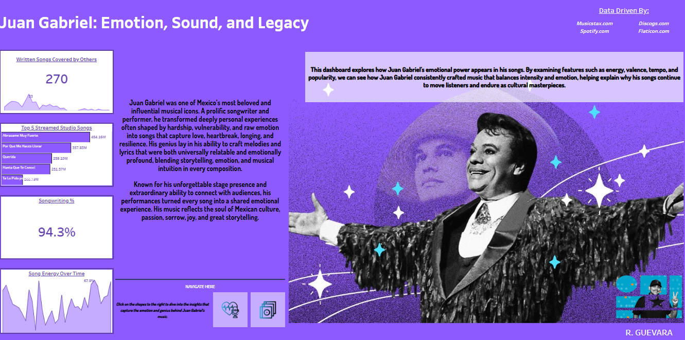
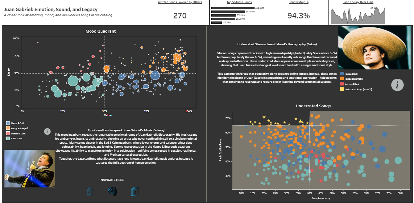
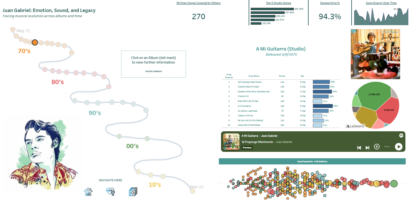
Users naturally move through a dashboard from top to bottom, and strong design embraces that rhythm. By placing your most impactful insights (KPIs) at the top and gradually revealing deeper layers of information, you invite continued exploration and sustained engagement.
The first two photos above show how I wanted to position the visuals once built. Again, these visions changed during the build. But I think its helpful to see how the blueprint affected the finished product, even if slightly (below).
A developed dashboard blueprint gets you started on the right path. Now you’re ready to build with intent instead of a runaway train. You’re the conductor and you’re driving this build from an idea to a visualization. The one main thing I have identified with drawn out blueprints is that I am able to visualize and sort those dashboard actions easily. I’ll quick you give you a walk-through of those decisions I have made.
Dashboard Design Decisions Made
I’ll give you a quick list of the decisions I made:
- Storytelling
- I had a large story to tell. I learned so much about his career when looking at the data. While I wanted to hit many story points; I am also mindful of not creating an intimidating dashboard. So I decided to use dynamic zone visibility to create sections that the user can navigate to with shapes and dashboard actions.
- Why? : This helps the visualization breathe, translating into a calming and inviting story to interact with.
- I had a large story to tell. I learned so much about his career when looking at the data. While I wanted to hit many story points; I am also mindful of not creating an intimidating dashboard. So I decided to use dynamic zone visibility to create sections that the user can navigate to with shapes and dashboard actions.
- Design for users who are new to Juan Gabriel’s music and story
- While Juan Gabriel is one of the most popular singers in Mexico; there may very well be users who have not heard of him.
- Why?: I give the user with 4 KPI cards that gives some quick insights to Juan Gabriel, almost like a setlist for a great concert.
- While Juan Gabriel is one of the most popular singers in Mexico; there may very well be users who have not heard of him.
- Visualizing a timeline in a different way
- When you click on the discography shape icon; you’re navigated to a timeline that walks you through Juan Gabriel’s studio album career.
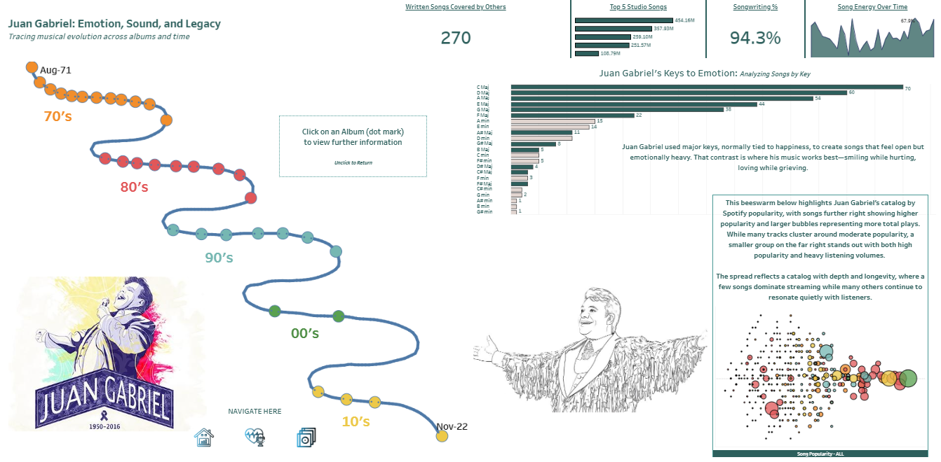
- Why?: Because Juan Gabriel’s career spans over five decades, I used a curved timeline with deliberate turns to visually distinguish each decade. Dot markers represent studio albums, and clicking on an album activates parameter actions that update the surrounding visuals.
- When you click on the discography shape icon; you’re navigated to a timeline that walks you through Juan Gabriel’s studio album career.
- Embedded URL Web Objects
- Not only did I want to share the insights I could uncover, but I wanted to give you the gift of his music.
- Why?: This is a music dashboard! But more importantly, while its eye opening to see the the genius in him. Learning how music features like energy and mood resonate with listeners is only properly reinforced with sharing his music. Using Spotify embed URL codes I was able to create a dynamic web object that provides a studio album preview from the application.
- Not only did I want to share the insights I could uncover, but I wanted to give you the gift of his music.
Remember, as a dashboard developer, every decision should serve the story—and only the story. One of the most important lessons I’ve learned is to keep things simple. While there are countless powerful and creative visualizations available, complexity doesn’t always lead to clarity. You could spend hours building an intricate Sankey diagram, but an area distribution or a simple sunburst chart can often communicate the same insight just as effectively.
Clarity is the goal: designing in a way that allows your entire audience to quickly recognize and understand the insights you’re presenting. By using dynamic zone visibility, I was able to prioritize insights and control the cadence of how the story unfolds for the reader. Whitespace becomes a design tool in this process—creating a clean, intentional layout that feels both focused and inviting.
Applying this approach consistently across the dashboard ensures that attention stays where it belongs: on the data insights and the story you want to tell. Finally, dynamic zone visibility enables progressive disclosure, allowing the narrative to unfold in a way that feels intuitive rather than overwhelming.
Closing Thoughts
There was three main things that I wanted to come across when I designed this dashboard:
First, Juan Gabriel was a true songwriting genius. Across his studio albums, he served as the primary songwriter or composer on 94% of his songs—a rarity in today’s music industry. This level of creative ownership is a powerful testament to the brilliance and authenticity of his work. This is why I chose those 4 main KPI boxes to be standalone on the first page. (They move to the top margin in the later pages but have their own spotlight on the default page)
Second, his music is uniquely emotional. Juan Gabriel had the rare ability to convey profound feeling in ways that deeply resonated with listeners, often expressing vulnerability and longing through high-tempo, high-energy songs that dominated music charts in Mexico and beyond for decades.
Finally, this dashboard is meant to honor his life’s work—his music. Through it, Juan Gabriel shared his vulnerability, shaped by a life marked by hardship, perseverance, and at times trauma. By giving us his story through song, he invites listeners to connect with emotions we may not always recognize or allow ourselves to feel.
