
Dashboard #4: All In The Wins:
Road to The World Series
Interact with the Dashboard: Click Here
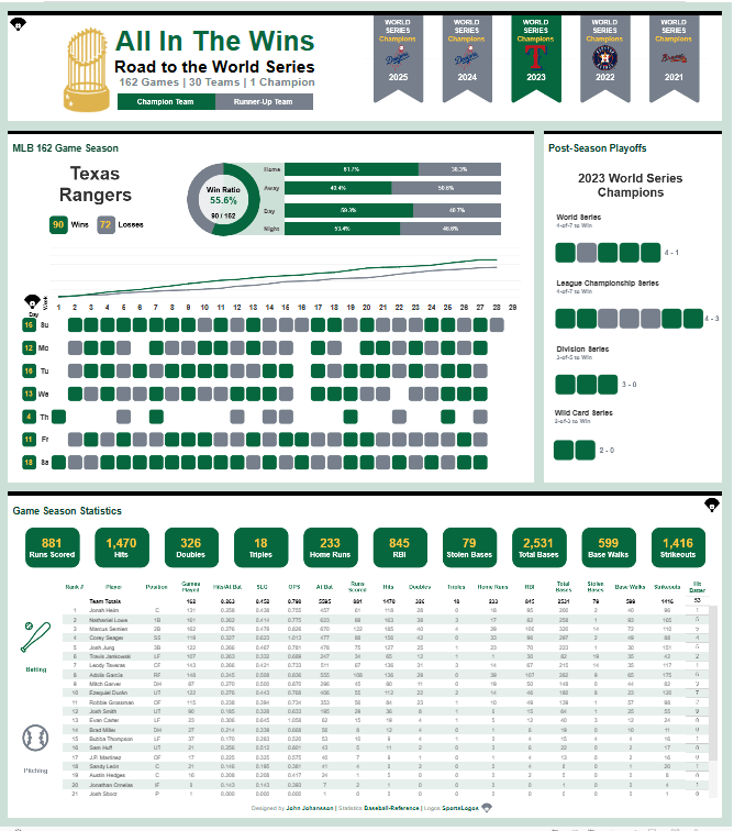
Today, we look at the Viz of the Day (#VOTD) from John Johansson. The visualization titled, “All In The Wins”, examines specific statistics for the last 5 World Series participants. Performance metrics range from player-specific KPIs to team performance from Opening Day to the last day of the World Series. From first diagnostic there is a large amount of information ready to digest through your interaction. I admire the use of the main containers and the intentional use of margins in the dashboard layout.
Dashboard Diagnostic: Lets lift up the hood
After interacting with the visualization for about twenty minutes, I noticed that the simple layout is very inviting and using hover as the main interaction with the dashboard you are able to digest large amounts of information. The visualization is team performance heavy, yet the bottom half provides season statistics per player.
After interacting with the final visualization, I downloaded the workbook to examine the design decisions and technical mechanisms driving the user experience. Today, I’d like to focus on several key elements: custom shapes, parameters, dashboard actions, container usage, and color choices. Together, these components work in harmony to create a seamless, intuitive experience while minimizing the risk of information overload.
CUSTOM SHAPES
- Rounded Boxes
- Main mark used across the whole visualization; primarily used for games across the season and in the postsesason
- Banners
- Positioned in the top-right quadrant, the colored banner shapes immediately signal which team is being analyzed. Their integration with team logos strengthens the overall MLB-themed design of the dashboard.
- Info Diamonds
- Hovering provides user assistance to the visual
PARAMETERS
- Three distinctive parameters allows the user (through dashboard actions) change information visualized by the following cuts: Team (Champion/Runner-Up), Stats (Batting/Pitching), and Year (Specific season from the last five years)
DASHBOARD ACTIONS
- Hover function of the dashboard action allows the users to change parameters and also change teams to drive the remaining containers for the full experience
CONTAINER USAGE
- Most containers are fixed, with intentional padding and a modified background opacity used to establish clear spacing. This design choice helps the visualization breathe and presents container-level information in a simple, digestible layout.
COLOR USAGE
- Color is used sparingly and purposefully in Tableau, with discrete values mapped directly to game results—green indicating wins and gray indicating losses. This approach aligns with Tableau best practices by minimizing visual noise and keeping the focus on data interpretation.
QUICK CALL-OUT
(MOUND VISIT)

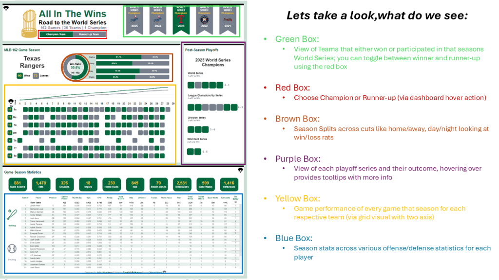
- Team Win Ratio
- Double Pie chart and intentional sizing results in a donut chart that visualizes win ratio (via red box in earlier image)
- Double-Header Indicator
- At times, teams throughout the season play two games on the same day (scheduled or via game makeup from an earlier postponement), on some teams you can see individual days with two color bands; this indicates two games played on that day (via yellow box in earlier image, for some teams)
- Team Totals
- In the bottom half of the dashboard, you can review player totals. Coordination with total only container allows users to view player and team performance for the same KPI. This is extremely useful as you cannot individually dictate the aggregation method for each KPI (sum, averages). (via blue box in earlier image)
Closing Thoughts: Last At-Bat
One aspect that stands out immediately is the deliberate and strategic design intent behind this dashboard. The color palette reflects a clear “less is more” philosophy—an essential business practice that every Tableau developer should follow. The data serves as the starting pitcher, while all other design elements play a supporting role, working to elevate and clarify the insights rather than compete with them.
A hover-based dashboard action enables users to cycle through data for all teams across the five-year period. Tooltips act as the supporting data layer, appearing specifically on game result marks. Hovering over the green and gray marks reveals detailed game results for both regular season and postseason play.
What I most admire about this dashboard is how effectively these elements complement the underlying data to deliver a cohesive, holistic user experience. In particular, the consistent use of padding within the tiled containers creates natural borders between sections, enhancing both readability and professionalism. Padding is often overlooked in the dashboard development process, yet maintaining uniform spacing across containers introduces symmetry and balance.
In this dashboard, the thoughtful execution of padding contributes to an elegant presentation and clearly reflects intentional, well-considered design decisions.
ABOUT THE AUTHOR
John Johansson is a Senior Associate specializing in analytics solutions at JP Morgan Chase. He is a 2X Viz of the Day author in Tableau Public and a 2025 recognized #DataFam Rising Star in the analytics community.
Check out John’s Tableau Public Profile here.
