
Examining My Spotify Playlist in the Last Twelve Months
Ever since I was a kid, I’ve felt a deep connection to music — the kind that sticks with you long after the song fades. Today, with streaming, that connection feels more personal than ever. Certain songs hold entire memories: hearing Rob Base & DJ EZ Rock or Brian McKnight instantly brings back moments with my late sister, who lived for early Hip Hop and 90s R&B. Bands like Green Day, Nirvana, and Metallica take me straight to my middle school walks home — Walkman in hand and metal headphones on. Then came 1992 and The Chronic — Dr. Dre changed everything, and Hip Hop became my lifelong soundtrack. Later, during late-night grad school study sessions, I found peace in the layered sounds of Explosions in the Sky and El Ten Eleven — the kind of music that doesn’t just fill the room, it fills your head with thought and feeling.
When Spotify made its U.S. debut in 2011, just four years after the first iPhone it changed how we experience music forever. Fourteen years later, with nearly 700 million monthly listeners, it remains a global hub for music discovery, connecting fans to artists from every corner of the world. It’s also become a launchpad for emerging talent, giving lesser-known artists a worldwide stage.
As a data enthusiast, one of my favorite things about Spotify is its transparency; your listening habits are all there, ready to explore. For this dashboard, I dove into my personal listening data to uncover my top artists over the last twelve months.
Along with the names of the artists you get the following data elements:
- Monthly active listeners and Subscriber numbers
- Your user rank and applicable world ranking based on all user listenership
- Other elements I pulled:
- Respective Genres
- Artist Image (genius.com)
- Artist Bio (created using ChatGpt)
- Artist embed url’s from Spotify
For this dashboard, I wanted to accomplish a few things:
- Create another image background using Figma
- Utilize dynamic zone visibility to ensure a simple dashboard render (eliminating a crowded feel)
- Leverage web objects to develop an interactive experience leveraging existing web assets
- Create a visual that stays to theme of music
Using Figma I wanted to create a simple image as a background that sticks to the music theme. For those that have seen some of my previous dashboards; I really enjoy dark contrasting backgrounds so the image used was perfect for my design. I used the photo below I prompted ChatGpt to create:

When I drew out my first strawman for this dashboard I wanted to create a very simple design. Remember from a dataset perspective the volume of elements we have to work with is not high. So with dynamic zone visibility, I have the method to deliver a simple design.
Using the web objects functionality in Tableau I want to show users a few things: artist image and utilize the embed player available with Spotify. The embed player is a great method to connect music and more notably Spotify to a wider list of potential users. You have data geeks like me using the embed player to provide dashboard users a quick and easy way to navigate to Spotify.
Back to the images — I sourced each artist’s photo from Genius.com, manually scraping the bio image URLs for all fifty of my top artists. I’m sure there are more automated ways to do this, but with a relatively small dataset, I was able to retrieve each URL by viewing the page source and pulling the direct link to the image itself. These URLs point to isolated images for each artist, which I then used to dynamically update a web object in my Tableau dashboard.
The idea was simple: when a user clicks on an artist in the main visualization, the corresponding image URL updates in the web object, changing the artist photo automatically. The functionality worked well with parameters—but I ran into a big usability issue. Each artist image came in different dimensions, which caused inconsistent rendering and, more annoyingly, those stubborn horizontal and vertical scrollbars.
A quick search with the need to dynamically resize images brought me to a post from data veteran Tableau Tim. He has a very informative and simple blog video explaining the functionality of the site cloudinary.com, an image, video and digital asset management tool. Using the site you can use the site to resize all your pool of images. The site has a free service that is limited to the number of times the site is used. A free account user has a limited number usage queries into the site. This method is a good option but with 50 artist images and perhaps multiple dashboard visits over time, I was afraid that the free limit would get breached possibly leading to an experience degradation in the future.
While this solution was not leveraged; I highly recommend you bookmark Tim’s website to learn all about Tableau and its evolution.
My next stop was a post by Ken Flerlage one half of the well-known Flerlage Twins. The site contains a large rolodex of blog posts from dashboard design, visualization spotlights, Tableau functionalities and many more corners of the application to learn from. In his blog post, Ken explains of the many issues he had encountered when working with an image URL that just does not comply. Using javascript Ken built a HTML utility that efficiently allows dynamic resizing for any image/webpage render. This was my first time interacting with javscript but after some pointed investigation and reading; I was able to grasp what is going on with this code. Using my GitHub account I was able to create a copy of the HTML script for my purposes. While the original code leverages the image URL and resizes its dimensions; I also wanted to add HTML code that will consistently align all image renderings to the center of the web object. Adding this style choice will ensure that every image resized will align to the center of the container for all images. Since I’m hosting the script on GitHub Pages, all image URLs now route through my repository, meaning we’re no longer relying on Genius.com and their varying image sizes.
Here is an example of the full URL for the resized image rendering:

The first part are instructions to the code I have in my repository and the latter portion (after imageurl=) is the original image URL from genius.com. Notice the full URL; both height and width dimensions are in the URL to be used by the HTML logic. This can be easily parameterized in your dashboard. For the sake of consistency I chose square dimensions to stay consistent for all artist images.
Ken’s post was very easy to follow and a great resource for my use case. If you do not have their website bookmarked; please check it out.
Now for the other web object; I want to be able to provide users an audio glimpse into my listening playlist. In the Spotify application you have access to embed URLs specific to artists, tracks and playlists. For this dashboard I wanted to use track embed codes for my artists. This gave me the opportunity to specifically choose which song for my artists to play as a preview for the user.
Below is an example of John Legend’s song “All of Me”:
https://open.spotify.com/embed/track/3U4isOIWM3VvDubwSI3y7a
URL executes the embed player to show and be ready for the preview to play. The serial number after ‘track/’ is specific to the track I chose for the song. Note: if you are planning to use the artist embed code, that is a separate serial number; the song previewed will be the most popular song played for that artist.
Here is what the embed player looks like:
Note: Word Press utilizes the straight track link for its Spotify widget functionality. The URL shown above is different but I want to show you what the player looks like.
I had my first exposure to the Spotify embed code and its functionality by reading Shreya’s blog Data Viz Fairy. Her site has a lot of great posts and guides to your journey with Tableau. Shreya is a Tableau Vizionary and Co-Lead of the Back 2 Viz Basics community project. You can find her specific blog post here.
Shreya’s post prepared me to collect the audio URLs needed yet my concern was how it would render in Tableau Public. I did run into issues when hosted on the Public server, the embed code was not being recognized even when I parameterized it. I was able to download a dashboard with this functionality to verify I have the correct settings on my web object. I was also able to recognize the differences in URLs offered via Spotify when I visited Louise Le’s blog post from the The Data School. In her blog post (click here) she was able to show the Christmas Song Advent Calendar dashboard she created. In the dashboard she was able to detail out the intricacies of the various URLs out there. Her blog post was instrumental in getting me to figure out the various ways that embed codes work in Spotify and that’s when the testing began! Through my testing in Tableau Public I was able to confirm the open.spotify/embed code needed to work on the Public server.
Both Shreya and Louise’s informative blog posts was the combination of learnings I needed to get my embed player to render successfully on Tableau Public.
Now the one thing I wanted to do was to pull all these functionalities together using a visual that stuck to the theme of music. Now a while ago I was able to attend the Analytics Tableau User Group where Tableau Visionary Louis Yu walked us through his Star Wars “Chromatics of the Force” dashboard. In that same meeting he also walked us through his quick way on how he transformed his data into a soundwave with the same climbs and dips of a real soundwave like below.

In order to maintain isolated parts of the sound wave; I decided to make a gantt chart which takes all my top fifty artists and sizes the chart bases off monthly active listeners. Given my eclectic taste in music, the variation of respective active listenership, I was able to create a similar rendering where every gantt bar represents one of my top fifty artists; view below.
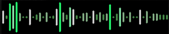
This immediately shows you which artists have huge followings compared to those unheard of gems of an artist that have connected with me.
Using dynamic zone visibility (with parameter help) I was able to create a simple dashboard that initially shows a soundwave and heatmap by genre into a glimpse of my listening preferences by interacting with the soundwave visual (First Photo is the Home view, Second Photo is when you click on an artist from the soundwave visual).
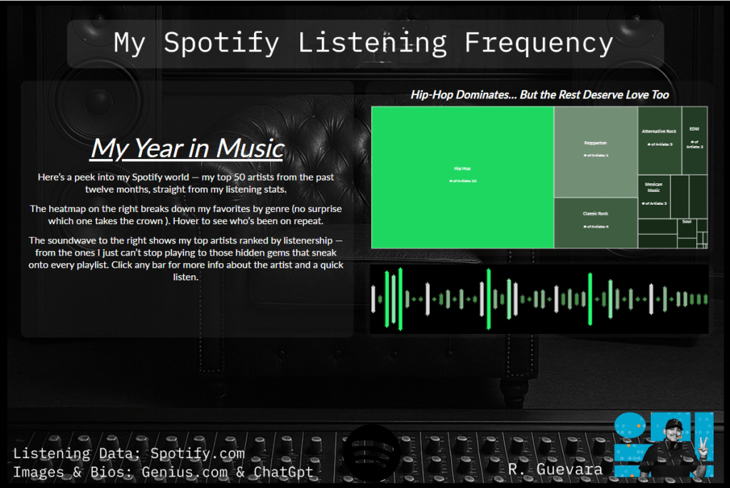

Notice in the second photo you can see the uniform/centered artist image and the embedded Spotify web player underneath the soundwave visual and image.
This was a very cool project to work with; I was pretty proud that I stuck to the strawman I drew out and was able to stick to a simple layout that I felt had more room to ‘breathe’ in comparison to my dashboard years ago. The one thing I enjoyed was the challenges I was able to run into and with the blog help from various #datafam leaders, I was able to resolve those challenges and provide a seamless user experience to my Spotify visualization.
Please visit my dashboard here: Click Here
Once again I would like to recognize and thank the following data leaders for their posts and for inspiring me!
