
A visual history of MLB trades and their ripple effects.
In every MLB season, team trade activity revolves around one key date — the official trade deadline at the end of July. For those less familiar with baseball, trades serve many purposes beyond just swapping players. Like any professional sport, baseball is a business, and success is measured in different ways. For perennial contenders, the goal is clear: make the playoffs and ultimately reach the World Series. But for teams further down the standings, the trade window becomes a tool for very different strategies.
I’ve always enjoyed thinking through the strategies teams employ when executing trades. Some will go all-in, acquiring high-value players to push them over the edge in a championship run. Others offload valuable players in exchange for future talent—draft picks or cash considerations. And occasionally, a team will orchestrate a full “firesale,” moving multiple players at once to shed financial burdens or stockpile prospects. A notable example came when the Miami Marlins dealt Giancarlo Stanton, Marcell Ozuna, and Christian Yelich—all present or future All-Stars—in return for younger talent.
Of course, not every organization leans heavily on trades. The Tampa Bay Rays, for instance, focus on developing players internally through strong scouting and their farm system. On the other hand, the San Diego Padres have often been aggressive on the trade market, treating their minor league prospects like poker chips in hopes of landing proven stars.
Note: MLB trade activity is not the only factor that influences team performance. Other elements like injuries, strength of schedule, player development, and overall management or team strategy, play a significant role in shaping how a team performs in the latter half of the season.
It was these types of use cases that really got me interested in the MLB trade market and its immediate impact on teams and their performance.
I was able to get approx. 15 years of MLB trade data from retrosheet.org, and while exploring it, I uncovered some interesting trends in trade activity between certain teams. In many cases, it seemed like specific teams consistently partnered with each other—almost like “trade pairs” tied at the hip. To highlight this, I built a heatmap that surfaces the most active team pairings over the last fifteen seasons. I designed it using map layers, which gave me the flexibility to display sized marks inside diamond shapes for a cleaner, more distinctive look.
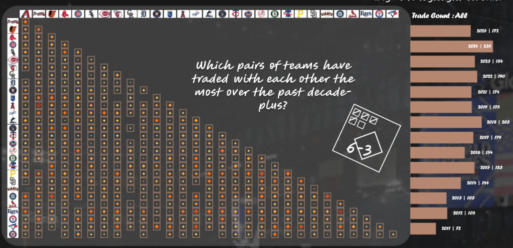
In the visualization above, you can spot the most active trade pairs by looking for the larger marks shaded in orange-red. To the right, I added a supporting bar chart that breaks down trades by year, with the option to filter it by team selection for deeper exploration.
While this view highlights trade activity well, I also wanted to connect it back to team performance. The key question: Do teams experience noticeable dips or spikes in performance after the trade deadline? Since most deadlines fall on July 31 or August 1, I plotted a date reference line and layered in key team KPIs—ERA, WHIP, AVG, and OPS. This allowed me to track whether newly acquired players influenced measurable shifts in team performance as the season progressed.
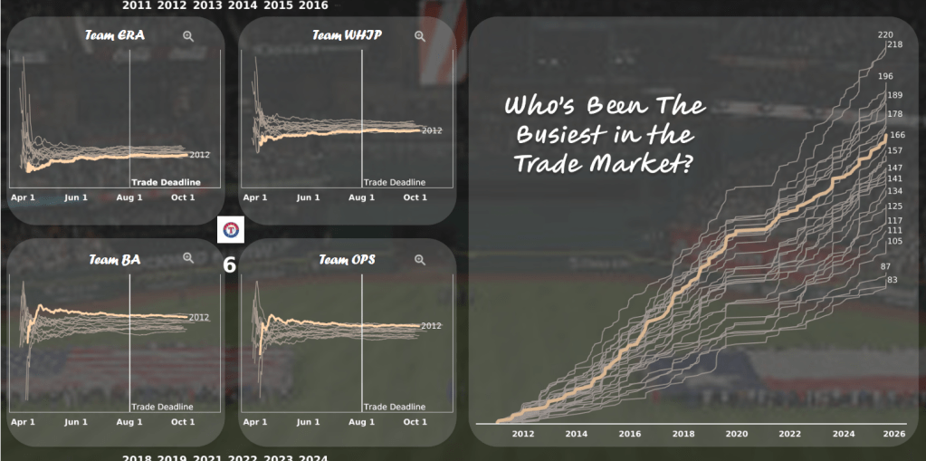
On the right, you’ll find a running total line chart showing trades across the entire dataset. By selecting an individual line (representing a team), the left side updates to display that team’s KPIs within quadrant visuals for the key stats mentioned earlier. To add more context, I also included marginal year containers along the top and bottom to highlight specific seasons in comparison to other years.
At first glance, you might notice there isn’t much variance in the KPI lines for a single team. That’s why I built in a way to explore these stats in greater detail. Look for the magnifying glass icon in the top-right corner of each quadrant—this feature, powered by Dynamic Zone Visibility, lets you zoom into a dedicated, enlarged view of that particular team KPI (as shown below).
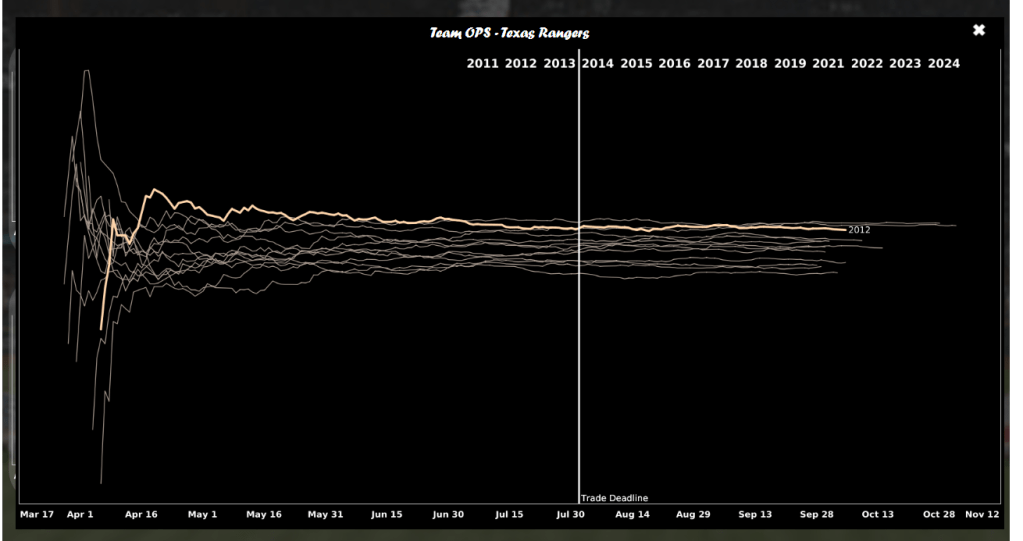
Here, I can focus on a single KPI for a specific team—examining performance metrics by season and even clicking on a year to highlight it with a color change. Clicking the “X” icon resets the view by returning a False result in the calculation that drives the dynamic zone visibility for that zoomed-in display. Pretty slick, right?
With this setup, I now had dedicated views for each of the four KPIs across any team I selected. But I wanted to dig deeper—what really happens when you evaluate those KPIs in splits? The trade deadline became my reference point to measure performance before and after. This type of split analysis isn’t new; teams, analysts, and media often use it around major milestones like the trade deadline, the All-Star break, or even a pivotal series that shifts momentum.
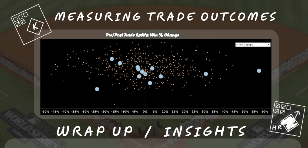
By applying this method, I could compare a season’s performance in a much cleaner, more structured way. To bring this to life, I created a scatter plot that maps performance shifts by season. Each mark represents a team and season, making it easy to spot outliers—teams that surged or slumped after the deadline.

The scatterplot above highlights Win % change, showing how the trade deadline has influenced teams with either a rise or drop in performance. Right away, you can spot clear success stories like the 2016 Atlanta Braves and the 2017 Cleveland Guardians, who posted post-deadline winning percentage jumps of +54% and +41% respectively. On the flip side, teams like the 2011 Minnesota Twins took a major hit, with a steep -47% decline in Win % following the deadline.
To make this analysis more interactive, I added a filtering feature. Selecting any mark like the far-right 2016 Braves point—triggers another scatterplot (powered by Dynamic Zone Visibility) that isolates the chosen team. The selected marks are highlighted and sized larger, making it easy to track that team’s post-deadline trends in a dedicated view (example shown below).
I especially liked this feature because it lets users instantly see all seasonal marks for a selected team in one view. To wrap things up, the final section of the dashboard showcases a set of team case studies where trade activity directly fueled performance boosts that helped push teams into the postseason. I end the dashboard with some proper citations and a created image of me with a URL action embedded over it to navigate you to this blog site.
In closing, this was the first time I was able to create a dashboard layout in Figma . The application itself felt pretty intuitive, making it easy to get started. While I’ll still revisit some detailed tutorials and blog posts, my first dive was enough to figure out how to build and arrange rounded boxes as placeholders for Tableau visuals. One of the more creative touches I added was designing icons inspired by traditional baseball scorebooks; the kind coaches (and stat nerds like me) use to track games. You can spot two of these icons in opposite corners of the scatterplot above. I also blended a photo of myself into a set of shapes, keeping with Tableau’s geometric theme, which gave me a unique and cohesive image style. Along with a photo I took at Globe Life Field, I was able to put all these together to create a custom layout in Tableau. With the image as the only tiled container, I can now place floating containers in their respective places (rounded boxes in layout), along with no background color gives the cool impression that these visuals were created in containers that I got rounded. This was a really informative exercise that started with retrosheet.org, some crafty manipulation in Alteryx, along with a custom background created in Figma; I was able to have a great start before I even started in Tableau.
Just another great tool to add to my data tool belt for those interested in Figma and interested in learning with me let me know!
Take a look at the dashboard yourself here: Click Here
Thank you very much for stopping by!
CHEERS!!!!
