Dashboard #3: Formula 1: Lap Times 2024

Today, we’re taking a closer look at a really cool dashboard developed by Dan Wade. Utilizing a ‘beeswarm’ visual chart; Mr. Wade takes a closer look at lap times in the 2024 F1 Race Season.
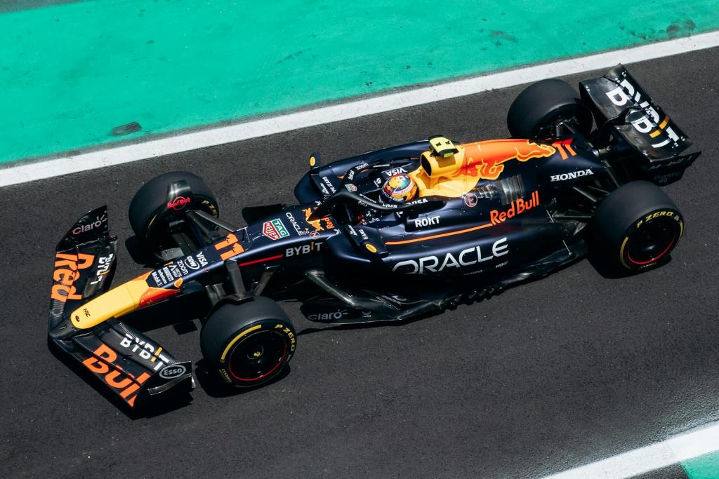
Formula One (F1) is an international motorsport for single seat drivers. There are races in the season all over the world. The vehicles are highly technical following a large list of specifications. Every team can uniquely work on their specific chassis and works in partnership with an engine supplier. Points are awarded every race to drivers and constructors (teams). The first 10 cars that finish the race get points for the season. All races are conducted on Sundays with Friday and Saturday consisting of Practice and Qualifying rounds to determine the starting positions for the official Grand Prix race. F1’s popularity in the U.S. has surged, thanks in part to new stateside races like Miami and Las Vegas joining Austin on the calendar. Netflix’s hit series Drive to Survive has also fueled the buzz, drawing in a whole new wave of American fans like me!
🔧 Join me as we pull this dashboard into the shop, download it, and take a closer look at the beeswarm chat visual.🔧
🔧DIAGNOSTIC/ASSESSMENT🔧
I also applaud the choice of visual for the dashboard. In the visual below, we see individual marks across multiple races. Main KPI we are assessing here is speed! In order to get truly comparable marks for the visualization; the dashboard excludes all ‘IN’ and ‘OUT’ laps for each race. This refers to the laps the resulted in entering and exiting the ‘pit’ area, confirming that every other lap will result in a more confident visual.
A ‘beeswarm’ chart here is a great choice because you want to display a large amount of data points (lap times per driver for each race). It looks similar to a scatter plot but a beeswarm is plotted on a single-axis. In this dashboard the axis (x-axis) is the measure of speed. This is a great visual to display multiple points; with the use of ‘jittering’, it eliminates any overlapping to clearly see the distribution of lap times where applicable. The use of color palette for each race allows a user to see individual race beeswarms amount the season population of lap times.
Below gif shows the visual at work when I interact with it:

- Download the workbook (in Tableau Public)
- By downloading the workbook, you can open the
.twbxfile in your local Tableau Public application.
- By downloading the workbook, you can open the
- After interacting with the dashboard on the Tableau Public desktop application, I was confirmed of a few things:
- This was a simple visual build with the ladataviz.com extension; yet, really impactful dashboard
- Visit LADATAVIZ.COM to learn more about compatible Tableau visual extensions
- The added dimension here is the intended use of color to isolate lap times for each specific race; you could have limited the color to constructors (like Red Bull lap times, Ferrari, etc.) to provide a different cut/visual of the data.
- This was a simple visual build with the ladataviz.com extension; yet, really impactful dashboard
- After navigating through Dan’s Tableau Public profile I noticed another visualization showing each Grand Prix circuit course (Check it out here)
- One thing that could have been interesting was to see the circuit image when the dashboard highlight function is activated (I choose a lap time from the Las Vegas Grand Prix; while all lap times are highlighted we could also see the circuit image)
- Do more straightaways add to faster average lap times (like the Austrian and Italian Grand Prix)?
- Or do circuits like Saudi Arabia and Japan with many turns translate to slower/safer lap times ?
- One thing that could have been interesting was to see the circuit image when the dashboard highlight function is activated (I choose a lap time from the Las Vegas Grand Prix; while all lap times are highlighted we could also see the circuit image)
Below shows the Japanese Grand Prix vs. the Austrian Grand Prix
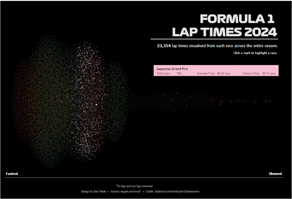

You can immediately see the noticeable difference in speed for these two races which also have very different circuit layouts below:


The Austrian Grand Prix circuit has more straightaways when compared to the Japanese circuit which allows all drivers to activate their DRS (Drag Reduction System) making the race performance more competitive.
In the downloaded workbook, I created a quick scatter plot using the RANDOM() calc to distribute the marks. While in theory we are accomplishing the same thing, its clear that the Beeswarm visual provides a much more sophisticated approach at visualizing lap times across all drivers for all Grand Prix.
Check out the gif below to see both methods highlighted:

🔧FINAL ASSESSMENT🔧
A scatter plot is like chunking all your parts and tools into the garage — sure, everything’s there, but it’s a mess and you waste time figuring out where to start. A beeswarm visual? That’s your workbench dialed and ready to roll.
I enjoyed playing around with this dashboard. The beeswarm visual and F1 data is the perfect match. It’s like a F1 driver and his crew; working together to accomplish a successful and competitive performance on the circuit. The dashboard visual displays the proper spread of clustered marks to easily identify lap performance by race and any outliers.

As I always say a lot of planning and work only leads to GOOD DESIGN.
🔧ABOUT THE DRIVER🔧
Dan Wade is a Data Analytics Consultant with The Information Lab based out of the United Kingdom. He was recently recognized as a 2025 DataFam Rising Star and earned Viz of the Day (#VOTD) honors twice with his work with Formula One data.
Check out his profile here: Tableau Public profile.
