
Dashboard #2: WALL·E Bar Chart

Main Dashboard: The Silent Revolutionary of the EnvironmentToday, we’re taking a closer look at a fun dashboard created by Hideaki Yamamoto/Chasoso. This dashboard leverages the Tableau and IMDB partnered Movies Plus Data data source.
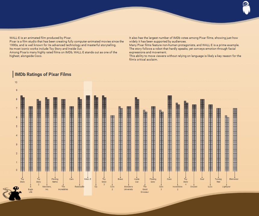
Today we will be taking a look at the bar chart located in the center of the long form dashboard above. I was really intrigued with this approach; the dashboard provides a view of the most significant Pixar/Walt Disney animated movies in the last twenty years. The bar chart illustrates IMDB ratings for each identified film. The cool part was that the developer chooses another ‘outside of the box’ method to illustrate this.
For those who haven’t seen the film, the story is set in a future where humans have abandoned an uninhabitable Earth, now overwhelmed by pollution and waste, and are living in space aboard a massive ship while they wait for signs of a livable planet. Left behind is WALL·E, a small trash-compacting robot, quietly continuing his task of cleaning up the planet alone. The film explores themes of hope, redemption, and loneliness; but more subtly a critique of human complacency and our growing dependence on technology.
I really liked how the bar chart gives me references to the film in two ways; the bar chart looks just like the abandoned skyscrapers in the film and it also reminds me of the processed trash blocks that WALL·E stacks throughout the workday.
Check out a closer look at the bar chart below:
🔧 Join me as we pull this dashboard into the shop, download it, and take a closer look under the hood at the user guide functionality.🔧
🔧DIAGNOSTIC/ASSESSMENT🔧
- Download the workbook (in Tableau Public)
- By downloading the workbook, you can open the
.twbxfile in your local Tableau Public application.
- By downloading the workbook, you can open the
- After interacting with the dashboard on the Tableau Public desktop application, I was confirmed of a few things:
- There was some crafty detail work done to show blocks as part of the entire bar representing each notable Pixar film
- Hideaki wisely created extracts from the IMDB dataset to create a workspace specifically for his dashboard; eliminating any unwanted data
- Which translates to a better user experience and a #respect head-nod from the Tableau teams managing space on the Tableau Public site

- Which translates to a better user experience and a #respect head-nod from the Tableau teams managing space on the Tableau Public site
- I also noticed that some of the dimension names were in Japanese; but with my familiarity of the IMDB dataset, I was able to decipher the dimensions used
- After unhiding the sheet was able to see that it was sourced from an extract that was joined with another dataset. The other data input that created the data relationship was a one column data set with two values: 1 and 2
- This tells me that there is some form of data densification occurring with the Pixar data.
- Data densification in Tableau refers to the automatic generation of missing data points to help complete a visualization, even when those points aren’t present in the original data. It’s helpful for filling gaps or distributing values to support visual continuity in charts and dashboards.
- This tells me that there is some form of data densification occurring with the Pixar data.
- After reviewing all the calculations leveraged in the visual; Tableau tells us (triangle icon in pill) that there is some table calculation edits executed to accomplish this visual.
Below shows the list of calculations created along with the original data dimensions used:

Above is a quick view of the dimensions and calculations created.
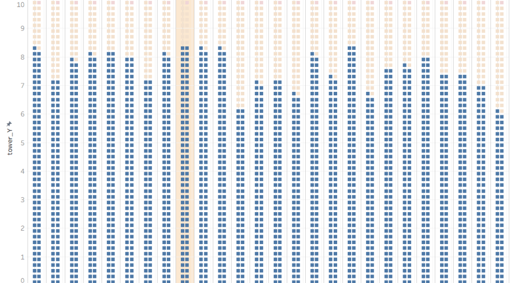
Tower_X when investigated achieves the double square shapes you see in each row of the film bar as a whole.
Tower_Y achieves proper height display of the square shapes are more importantly displays the correct proportion of each films bar shape across the whole visual.
Tower_back when aggregated with at an average and placed in details is used as a reference band to add shaded band on the WALL-E film bar ; a good design choice to help the user view its respective IMDB score compared to other Pixar films.
Tower_filter calc assesses each titles score with a calc of 10x the min score; this creates T|F result for the squares in each bar with the IMDB score representing the threshold of a True and False result (check out the quick view below to see both True and False results together; TRUE colored in light red/orange); filtering with a False value will get you the result you’re looking for
🔧FINAL ASSESSMENT🔧
It’s like taking the wheel of a well maintained car — everything’s exactly where you need it, the controls are responsive, and the whole drive is not just smooth, but a fun ride from start to finish.
I really enjoyed downloading this dashboard and taking a look at the ‘under the hood’ calcs that really make this visualization shine. Looking at alternatives to a native application or chart is always fun to me. Could a standard bar chart given the same insights to Pixar films and their associated IMDB rating; Yes, but this design clearly complimented the theme of the dashboard and creatively stood out against other charts that we are all used to seeing. I can definitely tell that this dashboard went through some careful design decisions to maintain an overall futuristic theme celebrating the film WALL·E.
As briefly mentioned in my introduction, I liked the film because just like this dashboard it takes a creative approach at explaining themes that are relevant today. Themes of overconsumption, environmental responsibility, connection and renewal to name a few. Looking even further, this film proved to be a significant step for Pixar as a company. This was their first film post their acquisition from Disney and was a monumental statement that Pixar can still make bold and emotional connections with the audience while still maintaining their creative freedom under Disney. While Wall-E really dives into some mature and thoughtful themes; it captivated audiences and opened the door for Disney to explore these themes in future projects.

As I always say a lot of planning and work only leads to GOOD DESIGN.
🔧ABOUT THE DRIVER🔧
Hideaki Yamamoto/Chasoso is a 2024 Tableau Public Ambassador who earned Viz of the Day honors with this beautiful dashboard. With over 200 dashboards shared on his profile, he’s an active contributor to community projects like #MoM and #WOW, and is known for his strong sense of design and user-friendly dashboard layouts.
Check out his profile here: Tableau Public profile.
