
Dashboard #1: MediTech Business Dashboard
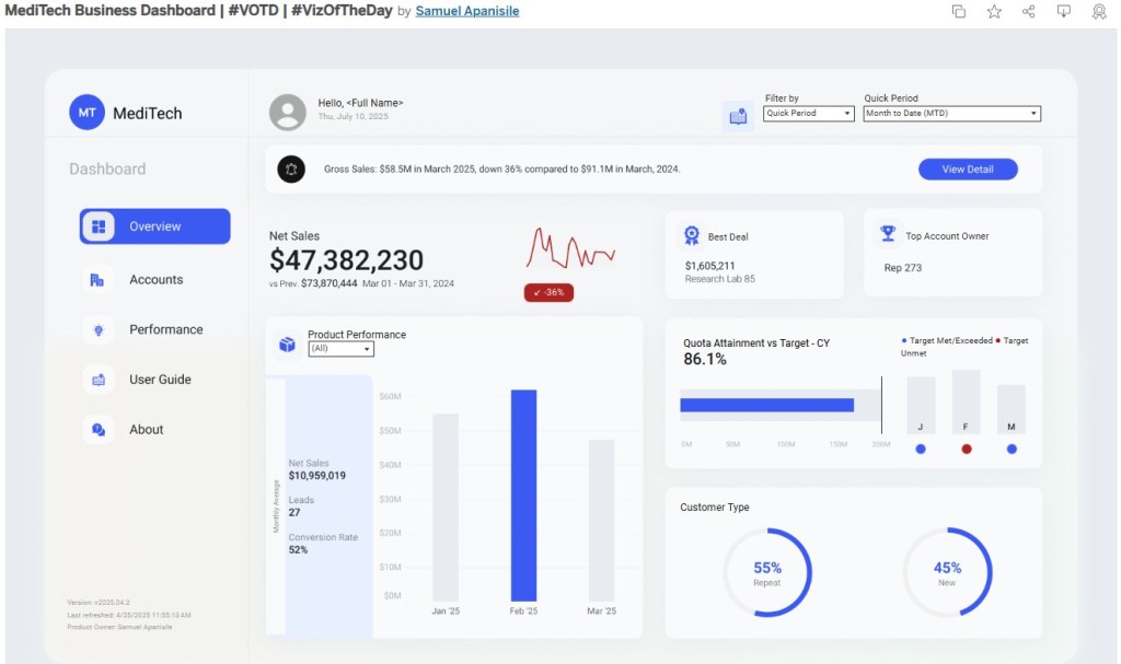
Main Dashboard ViewToday, we’re taking a closer look at a well-crafted dashboard crafted by Samuel Apanisile, who recently earned Tableau’s Viz of the Day (#VOTD) spotlight. This thoughtfully designed dashboard provides a comprehensive view of sales performance for a retail healthcare enterprise, covering everything from net sales and leads to product trends.
Samuel’s use of layout is deliberate and refined, resulting in a design that feels both simple and elegant while still showcasing multiple dimensions of performance. Behind the scenes, the dashboard leverages sophisticated functionality to create a seamless, integrated user experience.
Taking it a step further, I’ll be rolling this dashboard into the shop and popping the hood to check out its guide overlay functionality — a feature that really caught my eye during the test drive.
As someone who’s built dashboards before, I’ve often applied quick fixes like shape or icon tooltips to help users navigate. While these tooltips can give users a bit of guidance, they sometimes miss the mark: they don’t always point precisely to the part of the dashboard you’re tuning up, and if you add too much detail, the tooltips end up clogging the view — like an oversized air filter blocking the engine.
This guide overlay, on the other hand, feels like a proper custom upgrade: purpose-built, streamlined, and designed to help users see exactly what’s under the hood without getting in the way.
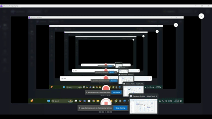
Below is a quick demonstration of the guide overlay functionality:
(along with some notes on the beginning of my investigation)
🔧 Join me as we pull this dashboard into the shop, download it, and take a closer look under the hood at the user guide functionality.🔧
🔧DIAGNOSTIC/ASSESSMENT🔧
- Download the workbook (in Tableau Public)
- By downloading the workbook, you can open the
.twbxfile in your local Tableau Public application.
- By downloading the workbook, you can open the
- After interacting with the dashboard on the Tableau Public desktop application, the first thing that came to mind for understanding the user guide functionality was to look at any dashboard actions driving this feature.
- In reviewing the dashboard actions created, I identified four (4) dashboard actions that work together to bring the user guide functionality to life (pictured below).
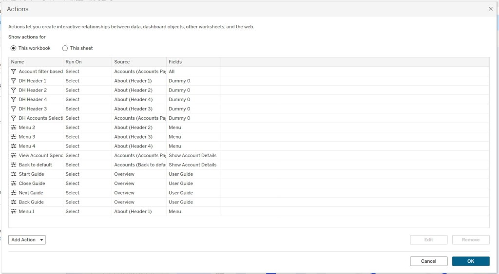
Notice there are four dashboard actions embedded within the Overview dashboard (identified as the Source of each dashboard action). From the icon shown to the left of each action name, you can see that these are all ‘Change Parameter’ dashboard actions.
This means that as users interact with certain parts of the dashboard, specific actions are triggered: in this case, parameters are updated based on user-driven interactions.
3. I brought in the parameter referred/identified in those 4 dashboard actions named : User Guide
I did this so I could watch how the parameter changes as I click through the guide overlay tour, using the back and next buttons to see the parameter update in real time. The parameter itself is an integer type, set to range from 0 to 5 with a step size of one. As I interact with the dashboard, I notice that clicking ‘NEXT’ moves the parameter from 0 to 1 to 2, and so on.
These dashboard actions, when triggered, display different views that highlight specific parts of the Overview Dashboard canvas. In the Layout pane, I can also see that these views are actually images that completely overlay the dashboard—each step or page corresponds to a different PNG file. The images appear to have been created offline in another application like Microsoft PowerPoint, using a blue background with white shapes that contain snapshots of the dashboard items being highlighted.
I also confirmed that the entire dashboard uses a fixed layout, which is expected and necessary to seamlessly layer these overlay images. Each image has a colored background with adjusted opacity. This design choice helps call out specific sections—almost like putting a ‘spotlight’ on that part of the dashboard (image below).

While interacting with the dashboard, the information guide tour starts when you click the icon of an open book. Through further investigation, I noticed there’s actually a small container or sheet placed over this icon.
In fact, every actionable button on the overlay, such as the guide icon, back, next, and close (X) button has its own small container/sheet layered on top. This setup allows the dashboard actions to run when published. So, when a user clicks on these shapes or buttons, the underlying dashboard actions are triggered to the desired functionality.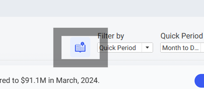
4 Once I identified the sheets used over the image buttons, I was able to identify that clicking those sheets were executing parameter actions with calculations in the details mark of each sheet
5. Each sheet had a calculation tied to it and there was four remaining calculations used for the dynamic zone visibility triggering of the overlay images
Below shows the complete lineage of the assets used for the information overlay tour functionality
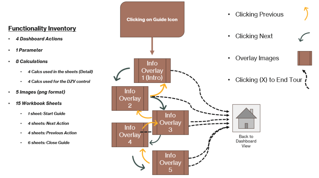
Above is a quick outline of how the guide overlay actions work: clicking through the information tour updates a parameter, which in turn displays different PNG images step by step. All five images are stacked on top of each other, floating above the main dashboard canvas.
Remember: the dashboard layout is set to fixed, which makes this overlay functionality appear seamless across different desktop resolutions.
🔧FINAL ASSESSMENT🔧
Clicking on the guide icon (which is actually a small floating sheet layered over the icon) triggers a calculation:
Calculation → <Parameter> + 1
This calculation, combined with a dashboard action of type Parameter Change, increases the parameter by a step size of one (moving it to the next allowed value).
The updated parameter value then drives the Dynamic Zone Visibility (DZV) conditions. These DZV boolean calculations determine which overlay image becomes visible—either moving forward to the next image, back to the previous image, or closing the tour altogether.
- Clicking ‘NEXT’ runs the calculation to add 1 to the parameter.
- Clicking ‘PREVIOUS’ runs a calculation to subtract 1 from the parameter.
- Clicking the (X) close button, which appears in each overlay or at the end of the tour, runs a calculation that sets the parameter to 0.
Setting the parameter to 0 effectively hides all overlay images by changing all DZV boolean calculations to False. This removes the guide overlay from view and shows only the original dashboard.
Once you have a applied the necessary front-ended work to your visualization; the only things you need make note of:
- Changes to the overlay images
- If there changes to the layout, visuals, or text description
- Changes/Addition to the calc functionalities if you need to add another overlay image description
It’s like sitting behind the wheel of a well‑built dashboard – everything’s laid out where you expect it, the gauges are clear, and the ride is smooth from start to finish.
I really enjoyed this functionality; once you understand the roles played by the various assets applied (sheets, calcs, actions, parameter, DZV control) you have a very informative and strong dashboard accessory. This allows you as the developer to always assist new users on the purpose, components and various visuals the dashboard has to offer. This allows you to maintain a simplified approach to a dashboard while maintaining a fresh look of the visualization. I was able to apply this similar approach to a dashboard I created, the only change I made from this approach was not applying a sheet over the guide icon; I modified the dashboard action (to start info tour) on clicking the icon itself and not a sheet floating over it. Other uses for this type of functionality could serve with highlighting certain figures and annotations if the dashboard layout remains fixed. I really enjoyed this exploration ‘under the hood’ of this dashboard. I can tell that a lot of great thought and planning went into developing this visualization.

As I always say a lot of planning and work only leads to GOOD DESIGN.
🔧ABOUT THE DRIVER🔧
Sam is a Tableau Public Featured Author and the founder of Viz Pulse Studios: a space dedicated to designing data experiences that combine sleek visuals with practical insights. His work is known for clean layouts, engaging interactivity, and thoughtful user guidance (like the Guide feature we explored today).
Through Viz Pulse Studios, Sam helps organizations and individuals tell better data stories by transforming numbers into intuitive visual narratives.
Check out more of his work here: vizpulsestudios.com or his Tableau Public profile.
 Ralph's Data World