
A Visualization of English Football’s Tiers
English football is structured in a multi-tiered system, with the top five tiers forming the professional and semi-professional backbone of the sport. The top five tiers of the “English Football Pyramid” are the Premier League, Championship, League One, League Two and National League.
National is considered the top level of non-league football; this league is a mixture of competitive and semi-pro clubs. Top teams from this league get promoted to the English tier system; starting in League Two.
Teams can move up or down these leagues through a process known as promotion and relegation. The top clubs in each lower division are promoted to the league above, while the lowest-performing teams are relegated to the division below.
Beneath the EFL, a complex network of semi-professional and amateur leagues, such as the National League, extends downwards, creating a vast system of interconnected divisions. This dynamic structure allows even grassroots clubs to theoretically ascend to the Premier League through successive promotions.
Today’s Idea: I wanted to see if there was a way to show the ‘movement’ of English clubs in the tier pyramid. How can I show a quick visual to show the promotion/regulation of clubs from season to season across all top five leagues; while still giving the user a view into a club’s attendance and season points results.

Dataset: All fixture results from all English football clubs across all five tiered leagues in the English Football pyramid from the last ten complete seasons.
Using Tableau I was able to work on the following functionalities:
- Parameters (creating a TOP N parameter)
- Using downloaded icons as shapes
- Partnering parameters with calculations to create sheets that disappear
- Using Sets to highlight and to create a calculated condition based on the number of marks in a set
Let’s discuss the data landscape first. Below is an idea on how the data is structured:

The data shows each match from the English football season. You can see that each observation has a date, time, a home team, an away team, and a score (other stats are there too).
Using Excel, I used some quick formulas to help me before I uploaded to Tableau. Specifically, I parsed out the score which is shown as 4-0 (for example) to a point result for Home and Away. This will help me once I am in Tableau to assign those points to the right clubs. Another problem I anticipated was how was I supposed to identify a list of clubs to aggregate point results; just based on the structure of the excel worksheet a specific club can end up in column F or column H (Home or Away respectively).
I decided to union the dataset on to itself. This gives me the opportunity to create this calculation:
IF [Table Name] =”Sheet1″ THEN [Home] ELSE [Away] END
This calculation allows Tableau to create a distinct list of clubs across all relevant dimensions in my dataset like League and Season.
First thing I wanted to create was a bump chart to show clubs ranking when compared to others based on their season results (match points). Using the Rank Unique functionality I was able to create the following bump chart for all the teams across five leagues:
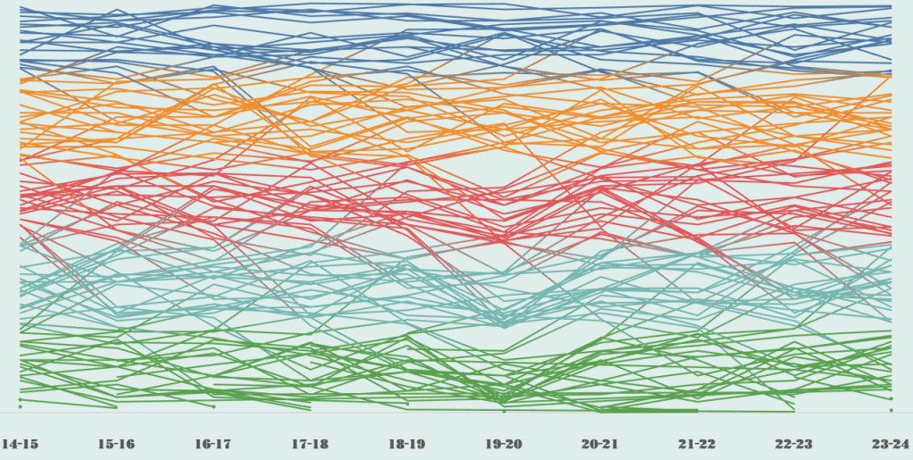
Applying the league dimension to colors, you can see the consistency of clubs in those leagues as well as the many club movements across leagues over the many seasons. Notice how I was able to show all clubs in one visual with ranking and movements. Remember, that a club who is a top club in a lower league, when promoted may very well find themselves bringing in the rear of the upper league in the next season (point results are independent of league). In order to still use the ranking functionality and have all English clubs in the visual. I created an adjusted points calculation based on league.
In order to maintain the pyramid positions of the tiered leagues, I assigned 800 placeholder points to every English Premier League club for each season; going down 200 points to each league while National League received no placeholder points. These placeholder points were aggregated to their table results per league. This allows me to not only keep them in the same visual but maintain proper ranking. This adjusted calculation was only used for ranking purposes where the actual point calculation for club was used in tooltip and mark labels.
Biggest thing I worked on here for my personal practice was the usage of sets in Tableau. Using sets I can highlight only those clubs in the bump chart to show movement over the last ten seasons. I can use the same set to the team dimension to create a dashboard action that allows the user to select multiple clubs and change the set in question. Using a count formula on the members in the set, I was able to create some boolean calculations that allows the user to see a clubs individual performance in attendance and season point results when only one club is selected.
This is key! I will explain once more; by allowing the user to only select one club this will trigger two views from below the bump chart to show visualizing attendance and point results by season. By applying a boolean calculation as a filter where I only want to show these views when one club is selected this allows the highlight dashboard action to work as expected when multiple clubs are selected. When multiple clubs are selected, the two bottom views stay hidden and the multiple clubs can be seen highlighted on the bump chart allowing you to see immediate performance movement of those said clubs.
Below is a view of the dashboard when a club is selected:
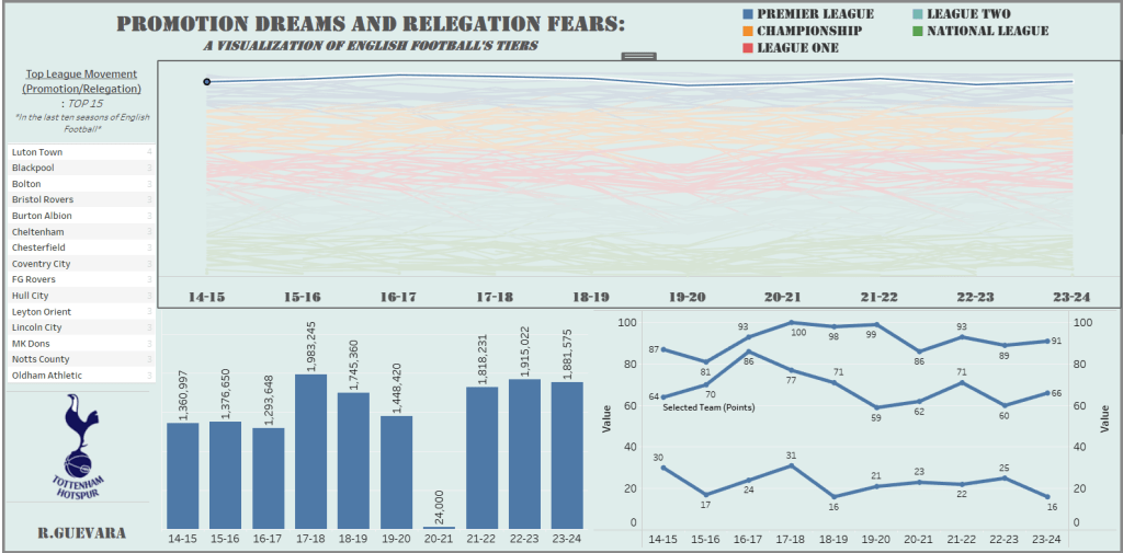
Notice when you select Tottenham (my favorite team) those two views populate in the bottom while the bump chart now moves to the top half of the dashboard.
This allows users to uncover various trends on each clubs performance over the years. For example, it will be normal to see a drastic drop-off of supporters at matches in the 2020-2021 season due to the COVID pandemic. However, attendance immediately surges afterwards and more due to the construction of the new Tottenham Hotspur stadium. A mainstay in the English Premier League, you can see that Tottenham has remained a fixture in the league while experiencing successes qualifying for both Champions League and/or Europa Cup. I like the bottom right line chart which shows the points result for the selected club along that respective season/league’s max and min points result. In the above chart, you can see just how close Tottenham has performed in the EPL.
Another cool thing I noticed was the movement that some clubs have experienced either via promotion or relegation. One team that comes to mind is Luton Town. This club just recently promoted to the Premier League; a long journey that started all the way back to League Two. This goes to show the journey that many clubs go through to make the main stage in English Football. Check out the visual below:

Notice the Top League movement table I created on the left side, I selected Luton Town which animated the above view. A fixture in League Two, Luton Town has proved to many that dreams do come true. Notice the significant increase in supporter attendance and performance in the last ten years. The change in color immediately shows the promotions that Luton Town has achieved in the last ten seasons.
This is a big deal; this would be like a college baseball team moving up to Single-A baseball, winning that league and then proceeding to win the next seasons at Double-A and Triple-A while now playing MLB teams.
Imagine an MLB team coming in town to play your college team at their stadium which probably has a capacity much smaller than a MLB stadium; its definitely a cool thing to see.
This was actually pretty cool to put together, I had always understood the tiered system but always wanted a chance to visually construct this.
You can find the dashboard here:
