
Using Tableau to visualize the playoff race
Dataset: http://www.baseball-reference.com
Today we take a look at the race to the playoffs in the West division for the American League in the MLB. The division champion earns an automatic bid to the playoffs and depending on record a bye to the second round of the playoffs. The Houston Astros came out victorious in 2023 beating the Texas Rangers in the last game of the season. An MLB season lasts 162 games which is a marathon to say the least. So many factors play a role in the outcome of a professional baseball teams’ season. You have injuries, trades, team chemistry issues/boosts and/or team collapses/surges towards the stretch run in the final months.
For todays discussion, we take a look at the AL West teams and their performance throughout the season while ALSO looking at a teams’ established postseason odds (as decided by baseball-reference.com). The idea here to is to view a teams’ odds of making the playoffs collectively with its respective performance indicators. What can we uncover when looking at both measures together. For this dashboard I wanted to focus on the Texas Rangers and see if we can identify any pitching KPIs that could have impacted some noticeable struggles throughout the season. While offensive production plays a significant role too, for todays post we will focus on pitching and its impact to the teams performance. The below is a screenshot of the dashboard created (I have overlayed some descriptions of the dashboard real estate):
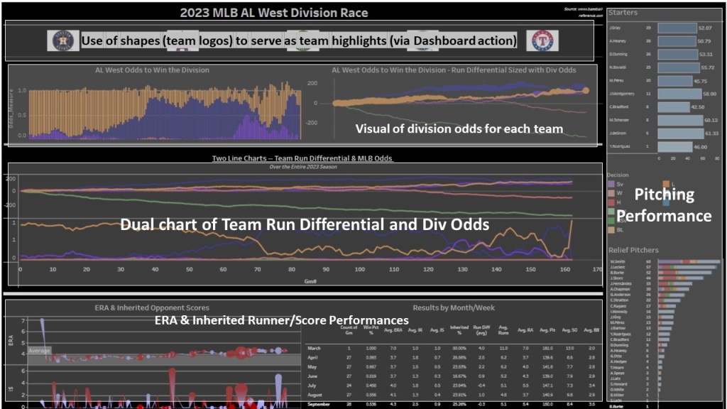
The following Tableau functionalities were created/used for the dashboard:
- Dual Line Chart: Team Run Differential and Division Odds
- Line Chart (sized with another measure)
- Tabular chart of KPIs by month
- Stacked Bar Chart
- Use of team logos to act as clickable highlighters on the visuals where all teams are represented (odds, run differential); enabled by dashboard action
The 2023 Texas Rangers emerged as a surprise powerhouse to everyone: media, other teams and even its own fans; me included. Immediately, the team exploded in offensive production; emerging as a division contender within the first few months. While Houston remained as the likely divisional contender; Texas continued to turn heads surpassing its pitching limitations with an abundance of offensive production. Many were wondering throughout the season whether this magnitude of performance was in fact sustainable. While some slumps emerged into the dog days of the season (August/September) related to some injuries with positional players, that was compensated with some well timed transactional trades that supplied the boost needed to turn the ship around. While some of these slumps impacted winning percentage; pitching remained a big question mark throughout the season. It is because of that I chose to isolate the dashboard around pitching and its effectiveness in the season. The big insight: relief pitching and middle inning relief opportunities were the cause of the biggest headaches. This led an influx of blown saves and leads which ultimately led to some large losing streaks in the season that invited teams like the Astros and Mariners back in the mix. This race was perhaps one of the closest divisional races in long time, where the division winner was not decided until the very last game of the season. While the Houston Astros emerged as the victor of the division; Texas secured a wild card postseason berth which started its unbelievable playoff run to the World Series Championship.
Follow me in the below video as I discuss how I built the dashboard together and the divisional race in the perspective from the Texas Rangers via data supplied by baseball-reference.com.
I hope you enjoy the video and GO RANGERS!!!!
