
Using DFW data we look at key measures that are important to the efficiency of airport operations.
For those that travel by air, you know that there are many pieces that move behind the scenes to ensure your flight leaves on time. There are many factors that may lead to a delay or worst a cancellation to your flight. Delays can come from issues from the ground crews, participating carriers, the network (flight control/FAA), weather issues, etc.
For the operations staff of our many airports, from a data perspective there are many key performance indicators (KPIs) that assist us in making ‘real-time’ decisions to improve the efficiencies of the operations for the many passengers that travel everyday. Below is a list of KPIs that I reported when developing my dashboard:
- Type of Flight Disruption
- Delay,Diversion,Cancellation
- Delay (in minutes; flagged to certain bins of delay minutes)
- Delay Reason (Carrier, Weather, FAA, etc.)
- Origin/Arrival Airport
- Airline Carrier ID/Name
- FAA Departure/Arrival times (used to calc delay variances)
- Date
For the sake of plotting coordinates for all these domestic airports, I was able to access GPS coordinates for all US based domestic airports (using Alteryx, I was able to add these coordinates to the dataset downloaded from the Bureau of Transportation).
You can download the same data at the following URL:
https://www.bts.gov/airline-data-downloads
NOTE: In an effort to create a robust dashboard while also not degrading user latency, I decided to only use flight data that either departed or arrived at DFW airport (Dallas Fort Worth International Airport). Flights were filtered for only domestic flights in the US.
Below is a screenshot of the dashboard:
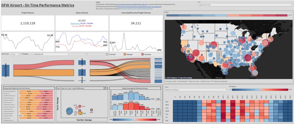
When white-boarding/conceptualizing this dashboard, I knew that I wanted to incorporated various views. There are multiple measures to report, so I wanted to make sure to choose the charts that gave the best representation for that measure. When viewing the many ways a flight can be held-up, i thought it would be great to visualize those impacted flights with a Sankey Chart. You can start with one population, your impacted flights and then effectively navigate them through the Sankey to their associated description of impact (delay by Nth minutes, cancellation, diversions, etc.).
I recently came across a blog by Tableau Evangelist Ken Flerlage:
https://www.flerlagetwins.com/2019/04/more-sankey-templates.html
The above link takes you to a great blog post about creating various Sankey charts, the one like the most was incorporating a parameter to control the whitespace in between the flow lanes of the Sankey Chart cohorts. I strongly encourage you to navigate around the treasure trove of Tableau posts/tips that are present there.
You can see I also utilized the GPS coordinates I joined in Alteryx and plotted across the continental United States. I also utilized both heatmaps and scatter plot charts to visualize flight/delay density and average taxi time (landing to gate and vise-versa). All these visuals wrap around BANS and Spark Lines that show flight volume, delays, and cancellations across a series of months. Using spark lines is a great way to show the user performance across a period of time while not utilizing much real estate of your dashboard (that was for the visuals).
In the following video below, I walk you through the dashboard and what I liked about it. Please do not hesitate passing along your feedback here or via LinkedIn. Thanks!
