Using 2023 Tour de France Data
So I am not sure if ‘long-form’ is the official term for these types of dashboards but for the sake of this conversation let’s pretend it is. I saw these types of dashboards for the first time years ago at a Tableau Conference when many Tableau Public dashboards were displayed in a museum theme at the convention center. I saw the usual suspects (business themed) but then I also noticed some longer style dashboards that seemed to incorporate images and some pre-formatted/created templates. I thought this was interesting; at that time in my tableau journey I was barely scratching the surface of the many functionalities that Tableau has. However, these authors to those dashboards had incorporated other tools within their dashboard creation process to complete some very elegant designs.
Now to present day.
I got caught up watching this reality series on Netflix about the Tour de France. This was something similar to those types of productions like Hard Knocks (for NFL on HBO), All or Nothing for Premier League Soccer (Amazon Prime), and Full Swing (Golf) also on Netflix. This series really gave a newbie like myself a peek into the competitive landscape of competitive bicycle racing. While there are other major races throughout the world; the alpha of them all is the Tour de France. Aside from the true competitive strategies that teams execute; the data side of the sport is really interesting. There are lots of things to really examine on the efficiency of a team and/or rider. After a simple search, I was able to download data for all 2023 stages (route info: coordinates, distances, elevations) and stage results for all riders. I felt this was a great opportunity for me to create a long-form dashboard where the user can examine multiple aspects of the Tour while not getting overwhelmed with data vizzes in the usual one-page style dashboard. I felt that if I can create different visualization cuts while also incorporating some great tour images (from a search) this combination may be a great challenge for my first long-form creation.
Below is a picture of my finished output:
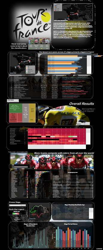
I created a fixed dashboard size so that it gives me the opportunity to use images as the background for all my visualizations. The images are all distributed evenly in a ‘vertical container’ and all the visuals are floating tiles that live above the background images.
Tour de France Logo:
- This gives a simple view of all the stage locations for the 2023 event while also providing some overall narrative to the race. I also placed a small picture with ‘hover’ capability to learn about the various classifications where riders can score individual and team points
Arc de Triomphe Image:
- This section provides an overall view of all stages and their distinctive measures
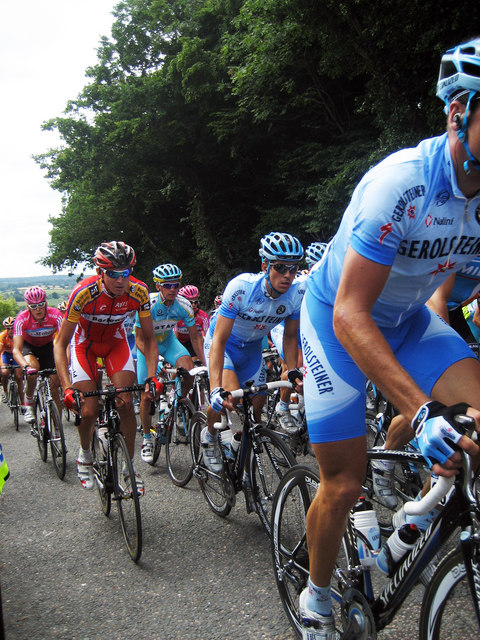
Rider Image:
- This section provides stage results and jersey winners while also recognizing the overall 2023 winner (pictured)
Team Rider Image:
- This section provides information about all riders and their teams (average age | nationality | bike affiliation)
Mountain Stage Image:
- This section gives the user the opportunity to select a single stage and view respective stats (route, elevation, highlighted distance, jersey winners)
With the creation of some parameters, the user is able to navigate to different stage specific information and change chart types. All the images that serve as background to the sections were downloaded from the web and then modified in powerpoint so that I can add some image blocks for the parameters that I schemed to use during creation.
Feel free to view the dashboard and navigate at the following link
Overall Thoughts
I am pretty satisfied with the dashboard and its look. A lot of planning went into creating this dashboard. I spent some significant time playing with the data and then manipulating (in Alteryx) to prepare for Tableau ingestion. I also spent some time drawing schematics of what I wanted the template to look like. Once I was happy with the photos I wanted to use as backgrounds; I navigated to PowerPoint where I did some picture formatting and shape inclusions for the sections where I felt parameters would be needed. Since all visualizations (along with parameters, legends, and filters) were on floating tiles, it was important that I had a canvas (dashboard background) that was fixed so that floating tiles/containers remain where I leave them. Another tip, I turned on gridlines on the dashboard to guide me with placement of all the floating containers. I feel that the long-form template is a great alternative if you want to guide your audience down to certain sections of analyis/visuals. While this is not the standard, the long-form template allows you to tell the story that you want the audience to see.
Check out the video below where I walk through the dashboard:
