
Today we create a simple dashboard using call center data. Before we dig into the data; let’s discuss call center data conceptually.
Call center data creates various opportunities for data developers to visualize. There are many ways to examine data generated by the normal operations of a contact center. As someone who has worked with contact center data before; I can tell you first hand that if done right you can uncover some really great insights from this data.
There are various ways to examine the data. You can use it as tool to score performance of your contact center agents. Examine call durations, pre-determined service level agreement achievement rates, conversion rates (for those that are in a sales/acquisition environment), transfer rates/call resolution accomplishment, escalation events, etc.
You can also use it as a tool to enhance your overall call infrastructure. Examining call abandon events or wait times before reaching an agent can uncover issues with coverage or the infrastructure as a whole.
You can also use the data to build a profile of your average caller. What are the reasons that they are contacting you? What types of call disposition create the longest call durations. Does customer tenure have a correlation to call intent?
A robust call center data platform in partnership with a methodical post-call satisfaction scoring campaign can also lead to some great insights around caller satisfaction and issues that need immediate attention. Remember after those calls, your contact center agents says something like, ‘After we disconnect please take the post-call survey to help me do my job better’. For those that stay on, their answers to that survey are vital in improving the customer experience when interacting with the contact center.
Let’s dig into the dataset!
First thing is first, the data is fake data. I ran into a great site where you can download different data sets. Its all fake data; yet, the data is different across various industries which allows developers to visualize differently. When looking at the call center data I noticed the following dimensions that I can use:
- Reason Type (reason for call)
- Service Level Agreement Flags
- Date of Call
- Type of Interaction (Call, Bot, Chat, etc.)
- Geo-Location of Caller
So to call back to the start of the post; the above list is minute to the reach that a ‘full’ call center dataset can give you. However, when creating a practice dashboard, I feel this is a good start.
I wanted to create a dashboard that shows different visuals but also interacts together using a few dashboard actions.
Let’s discuss the dashboard and its components.
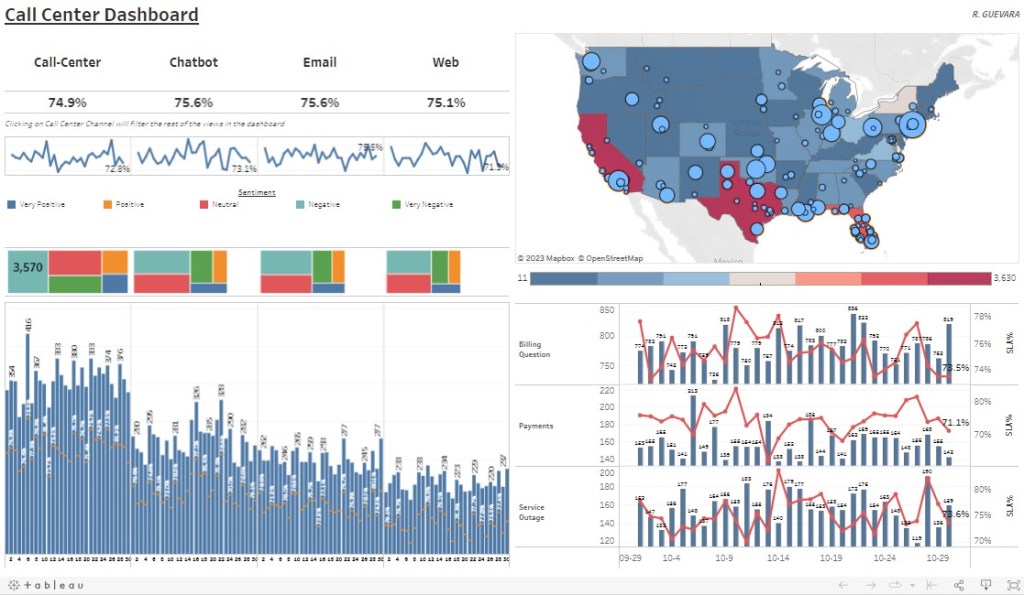
- BANS – I wanted to show a overall aggregate measure by interaction type; I felt showing this as BANS would be a good option
- Treemap Charts – I wanted to show distribution of calls for the month across sentiment, this can immediately show you the leading sentiment by interaction type
- Map Chart – I used the map functionality to show call cohorts by both state and city while utilizing map layers for each respective location (state, city)
- Dual Chart – I created two here; one that shows volume of calls for each day by interaction type; but also a Gantt chart to show if SLA was achieved that day. The other dual chart shows call volume by reason type and a line chart of SLA%.
- Dashboard Actions – A few actions here, one is the highlight action (if you select the BAN title of ChatBot, this will highlight the BAN you selected); and a filter action (if you select the BAN title of ChatBot, this will filter all adjacent views for ChatBot only)
Below is a screenshot of the dashboard you can find on my Tableau Public Profile :
Check out the video below as I talk through the build of this dashboard
