
This week I took a stab at creating both a Pareto chart and Box Plot chart.
A Pareto chart is a dual chart with bars and a line graph; individual values are represented by bars and the building cumulative total is represented by a line graph. Named after Italian engineer Vilfredo Pareto who made the observation that 80% of the impact/effects comes from 20% of the available products (tableau.com).
A Box plot or sometimes called a box and whisker plot chart indicate the middle 50% of the data analyzed, represented by middle two quartiles of the data distribution. All other data points are represented in the outward quartiles closed by configured lines, sometimes called ‘whiskers’ (tableau.com). This is a great way to visualize data distribution across a selected measure.
For todays exercise, I will be creating a pareto and boxplot chart using 2019 Boston Marathon data I was able to find online. Data set used contains all runner names, country of origin, gender, age and finish time. Using the data available I created a sample Pareto chart to show how many runners make up 80% of the total runners finished. Using the finish time measure, we can see at what point during the marathon does 80% of total runners gets eclipsed.
I also created a box and whisker chart to distribute runners using the finish time measure but creating a gender cohort. We can compare finish times and distributions by gender. I also created some other charts to show finish times by age bin and country of origin so that I have some additional visuals to create a quick dashboard.
First lets start with the Pareto Chart (screenshot below):
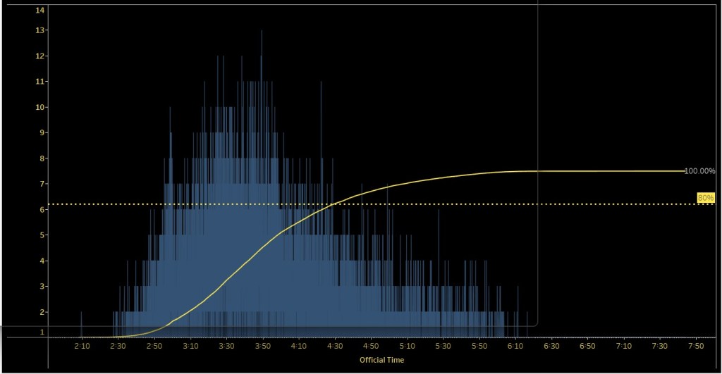
- I placed the time measure (Official Time) in the Columns pane
- Two charts created (rows pane)
- Bar Chart represented by count of runners that finished the marathon
- Cumulative line chart representing a cumulative number of runners (ascending) towards 100%
- Dual chart to combine both bar chart and line chart
- Note: Most pareto charts sort their bar charts in descending order, in this case since every data point is a different runner I decided not to sort to give a representation of finished runners and time elapses
- I also created a static reference line (dotted line) representing 80% of runners finished, so you can immediately see at what point in the race did 80% of total runners cross the finish line
Now lets take a look at the Box and Whisker Chart (screenshot below):
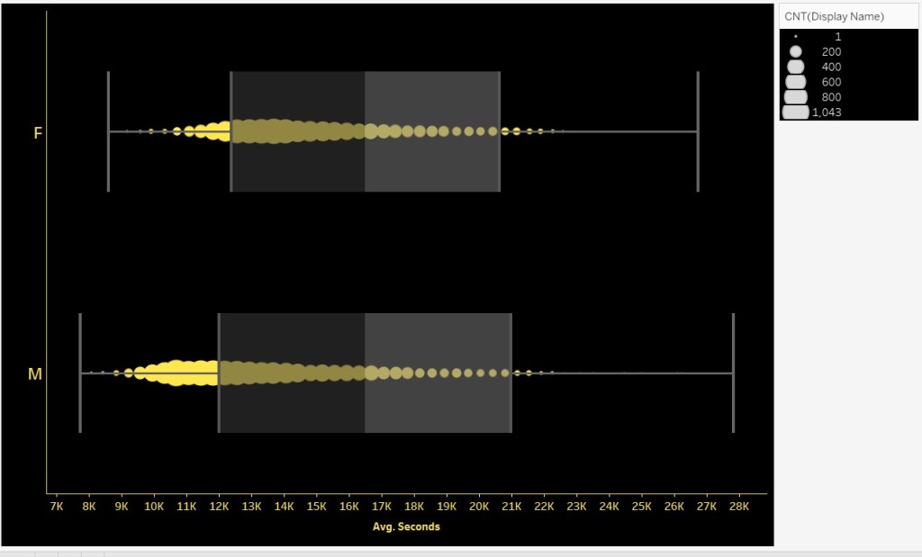
- I converted finish time to seconds and represented the measure to average seconds just to get a better representation of the distribution of runners (this was placed in the column pane)
- I also placed the dimension gender in the rows pane
- This will separate the data into two box and whisker charts for each gender
- Creating a chart like this, tableau will automatically show you the quartile measures; this time using the number of runners. I placed the count of runners in the size mark so that marks vary by size for the number of runners represented at that average seconds mark
Check out the variability of quartiles and mark density when compared by runner gender.
REMEMBER!!!!!! Creating the charts is half the challenge; always dedicate some time to format and add further context with other functionalities like annotations, tooltips with further info, etc.
Check out the video below to see how I created these two charts and walk you through the simple dashboard I created for my Tableau Public profile.
And like always, feedback is always welcome! Lets learn together!!
