
This week I take a look at a prior dashboard I made in the past (in my Tableau Public profile) and using the same data give the dashboard a tableau makeover.
Dashboard: I take a look at average Fahrenheit temperatures in my hometown of El Paso, TX. It is located in West Texas and is known by its moniker ‘The Sun City’. Known for its desert scenery and extreme high temperatures year around.
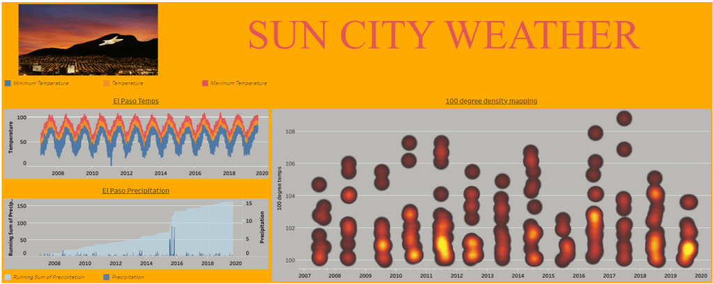
The original dashboard that I published back in September of 2019:
Inspiration
I recently saw an Instagram post posted by @tonyppt_ ; known as Tony the Power Point Expert. Check out the post below:
My initial thoughts were what a unique alternative to add a unique touch to a project. I immediately thought of incorporating this creative slide tip in my El Paso Temperature dashboard. In the initial view, I have a thumbnail photo of El Paso but I felt perhaps using this tip as a way to create a suitable background would add life to the view and data findings.
Quick Steps from Tony’s post:
- Find your image and insert above the entire slide
- Add a shape over image (preferably a rectangle to cover the image you just inserted)
- Right click on the shape (should be filled by color) and choose format shape option
- Line Category= NO LINE
- Fill Category= Gradient Fill
- Adjust your Gradient Steps (default has around 3-4 steps); play around with it and choose what works for you
- Adjust the transparency to show the image underneath the shape
- Add a title via title box
- Select all shapes (text box, shape, etc) and use the ‘Subtract’ function in the Merge Shapes option
- Group all selections and group them to save as photo
Note: I added some black boxes in my background photo to serve as backdrops for the views I was going to add once I build the dashboard in Tableau.
Using the above method; I was able to resurrect the old dashboard to the below:
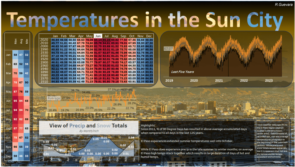
What I did differently on the data aspect:
I was able to access data for min, max, avg temps in El Paso spanning back to 1900. I added a left margin visualization of all min, max, avg temps for each month from the whole dataset. I also binned the cohorts of years by ten year intervals to show the heatmap you see above based on average temps for those respective months. Middle line graph shows a percentage of total by year of 90-degree temp days in El Paso. Both precip and line graph (for last five years) are still the same from the old view but I like the new background.
What still bothers me is the top right graph, I wanted to find a way to show min, max, avg temps in a line graph but I also wanted it to be transparent below and above the range of those respective temperature data points. Notice how try to use the pick screen color option in Tableau to pick a close color to the background; but due to the gradient fill, that would prove to be tough. I am sure there is a way to create this, I just need more time to think this through.
What are your thoughts? What helpful tips can you provide to help me achieve that issue with the top right line graph?
Check out Kevin Wee’s post about how he has incorporated templates into his dashboard (You can find his blog here):
